Patterns vs. components in design systems
August 27, 2020
One of the biggest challenges you’ll face when creating a design system is striking an appropriate balance between overly prescriptive guidelines and allowing too much customization. Make your components too rigid and they won’t work in many contexts, leading people to spend a lot of time working outside of the design system. Build in too many options and configurations to your components and you lose most of the consistency and efficiency promised by a design system.
Components form the majority of the guidance in most design systems. They’re fully specified and redlined, and perhaps backed by an HTML/CSS/JS implementation as well. A few configuration options may be offered, but by and large components tend to be a what-you-see-is-what-you-get type of resource.
I’d like to introduce the idea of a different type of resource, which I’ll call a pattern.[1] This type of guidance works great for situations that need some degree of consistency, but where a full component would be too constraining. Let’s look at an example.
Consider an accordion that opens to reveal more content. These are pretty common elements seen in all sorts of websites and apps. In fact, they’re so common perhaps you intend to use them in several different parts of your experience. A small accordion within the help content, a larger accordion for partitioning settings, and you’re even using a similar paradigm in your tables to display tertiary information.
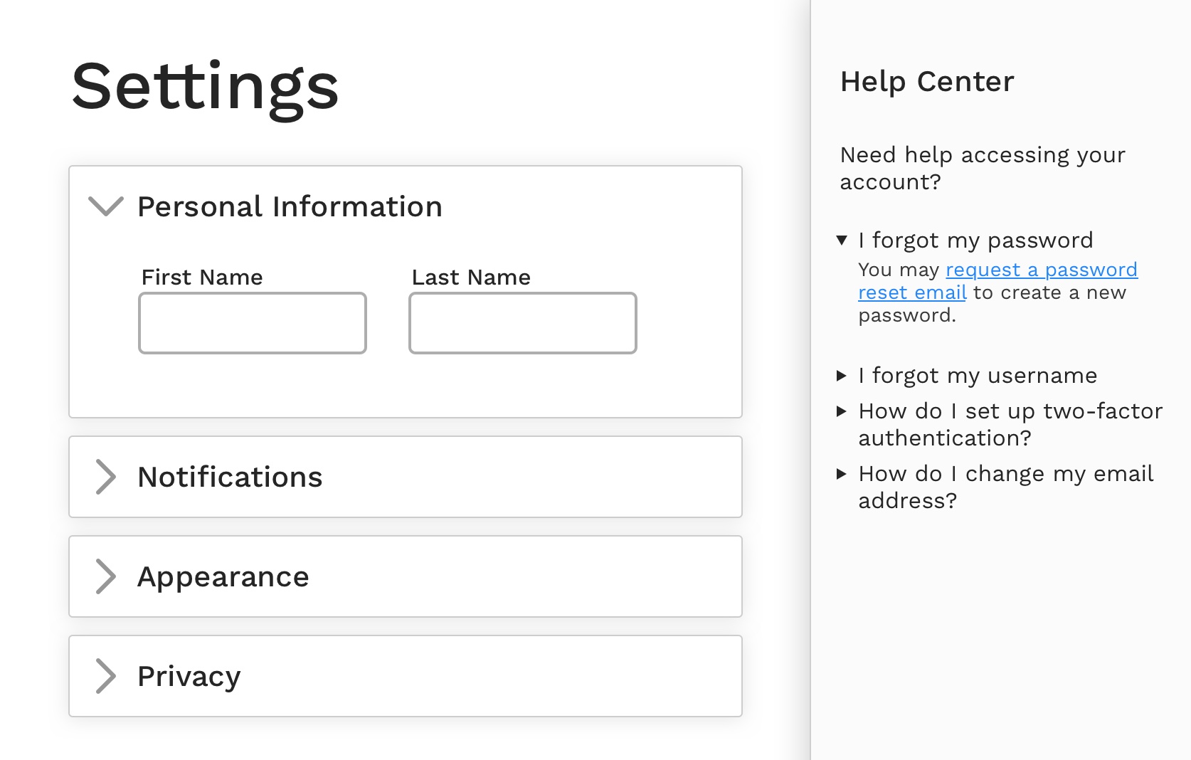
While these all fit under the category of “accordions”, there are enough differences that it would be difficult to create one component that works in all cases. Maybe you create separate components for each use case: a default accordion, a small accordion, a table accordion, etc. But this approach limits reuse, isn’t super sustainable, and won’t scale easily to support new accordion use cases you might discover in the future.
This is a great scenario for an accordion pattern. A pattern doesn’t fully specify every dimension and style associated with a bit of UI. Instead, it focuses on describing a few key elements that should stay the same between different occurrence of the bit of UI. Let’s consider what the various accordion instances need to share with each other.
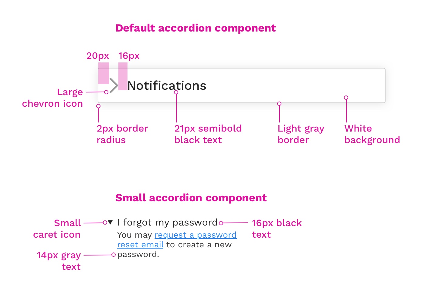
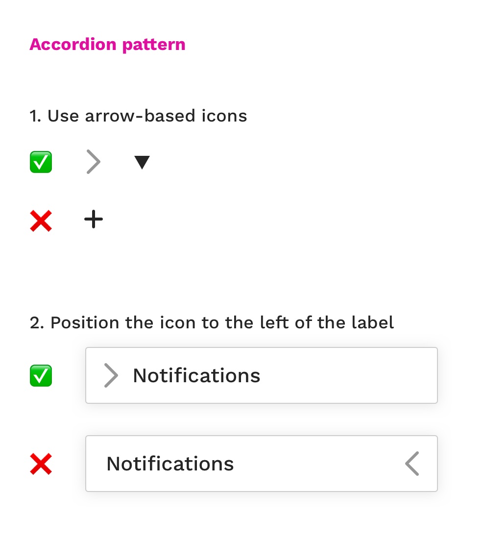
- We want to use similar icons for identifiability
- We always want the icons to appear on the left for consistency, and to better support screen magnification use
- Accordions should animate in a similar way
- Most accordions should only leave one segment open at a time
We’ve decided these are the most important elements to give an impression of consistency to our accordions. Sizes, backgrounds, and colors can be tweaked to fit each use case, but as long as the pattern tenets are followed our accordions will be consistently identifiable and functionally similar.
From a design system perspective, patterns allow you to be a little less prescriptive than full components, while still providing strong guidance in a few areas to help achieve a degree of consistency and quality. And we didn’t have to create and spec a raft of slight variations on the same component!
Don’t forget you could consider pairing a pattern with a component as well. Let’s say the default accordion we specced out earlier works for 65% of the use cases in our product. Maybe it makes sense to provide one core accordion component for those scenarios and then pair that guidance with a broader accordion pattern to support the other 35% of use cases.
One tradeoff of the pattern idea is that you may lose out on some of the developer efficiency that comes from a fully specced component. Instead of building a component once, a pattern may need more custom code for each instance where it appears in the product. Often you can share some foundational code between the different instances of a pattern, but it is a consideration.
Ultimately, the pattern concept is about making the design system work for you, your processes, and your use cases. A full component isn’t always necessary, but that doesn’t mean you should give up on providing some standard guidance.
— Parker
I’m probably not the first to have this idea, but I haven’t seen a detailed description of the approach before.
Also, an aside on the name pattern: I’ve found terminology can be a bit of a confusing point within the design system world, especially if you’ve adopted Atomic design verbiage. Atoms, Molecules, Components, Elements, Patterns, Templates — what do they all mean?
Component seems to have the most consensus behind it as a signifier for a whole chunk of UI or functionality. It implies completeness, tangibility, reproducability. A standard 2x4 or 2" nail.
I think “pattern” implies a looser set of conventions that may appear in many different forms. More a family of related species that share common traits, but each with some unique flair. ↩︎
Subscribe to posts by RSS.