2016 – 2018
Creating Pearson’s Design System
Bringing efficiency and consistency to our designs with standardized UI components and patterns
The Problem
When I first joined Pearson there was no collection of common design patterns or components.
Designers wasted time repeating the same work – how many times did we really need to design a button or modal dialog? And they had to create specs for every element when it came time to build.
Variations inevitably crept in, despite designers trying their best to create pages that matched.
In just two of our core products we had hundreds of slight design variations:
Product A
69 different font styles
118 unique colors
149 different breakpoints
Product B
42 different font styles
46 unique colors
112 different breakpoints
My Role
Discovered & documented the need for a standardized approach.
Advocated for a comprehensive design system.
Designed and documented numerous components.
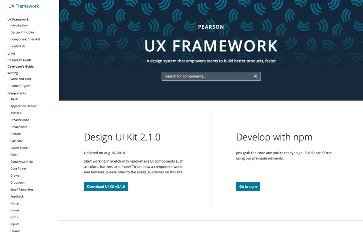
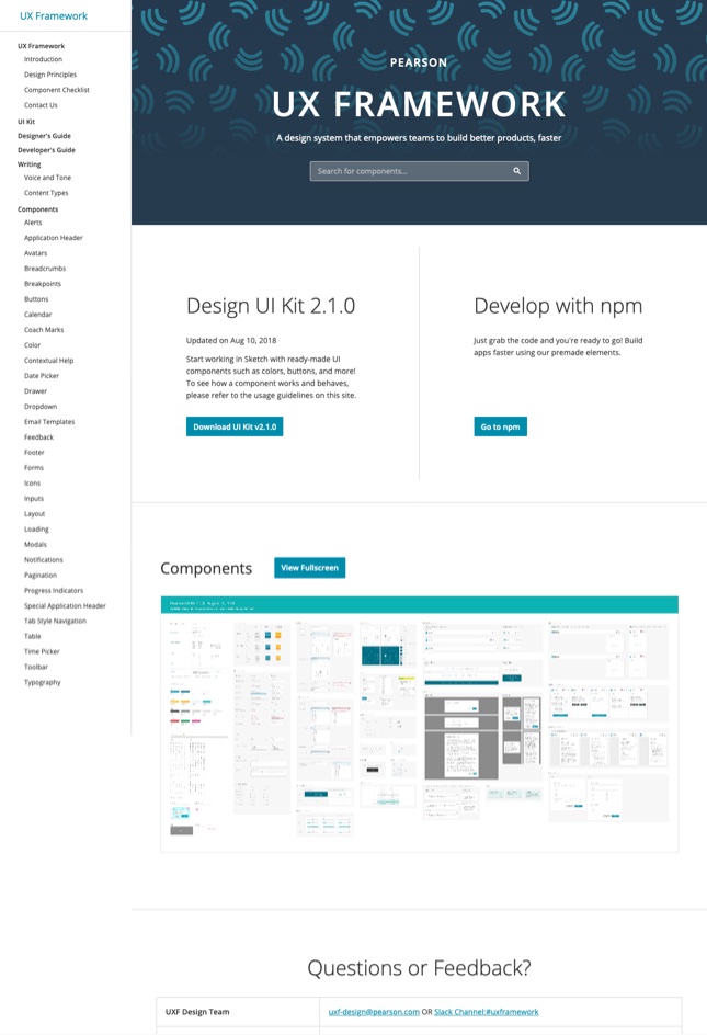
Built a website to host all of our guidance.
Trained and coached team members to contribute their own guidance.
Process
It was easy to feel the pain of a disorganized approach to design. Every page you touched had different breakpoints, different button dimensions and colors, and different font sizes.
I documented these inefficiencies and advocated the idea of establishing shared styles to design leadership. Around this time one of Pearson’s Architects created a development team to solve similar problems faced by our frontend programmers.
Design leadership created a small design team to collaborate with this developer effort and work towards consolidation of our elemental styles.
I joined this effort as a founding member, excited to help solve the issues I was running into on a daily basis.
1. Collect existing styles
To begin, we needed to understand the core use cases and needs that our numerous design variations were created to address.
We combed through nearly every screen in our main products and collected as many colors, font sizes, and button styles as we could find.
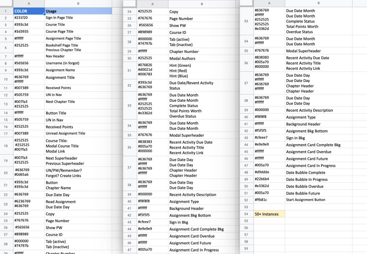
We used spreadsheets to keep track of all the different styles found in our design files.
Here’s an example from our color audit, which identified over 50 different values in use.
2. Consolidate styles
With the complete catalog in hand we set out to delete repetitive and overlapping styles, eventually reducing the extensive hodge-podge into a concise and powerful Swiss army knife of patterns and components.
Excited to quickly share with our larger team, I copied the open source website of a similar project and customized it with the new guidance we had created.
It was a bit ugly, but we were off to the races and excited to refine the design system into an essential tool for Pearson’s designers.
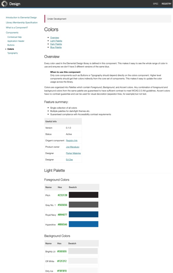
Examples of our very first component pages.
3. Improve documentation
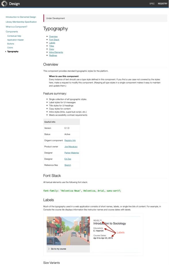
Our initial focus was on creating a clearer and more usable structure for the component pages.
We knew these pages would eventually grow to contain a lot of information, such as when to use certain components, how to configure them, or specific accessibility considerations. Our improvements needed to make it quick and easy to scan and digest pieces of this information.
Deep dive
Redline improvements

Deep dive: Redline improvements
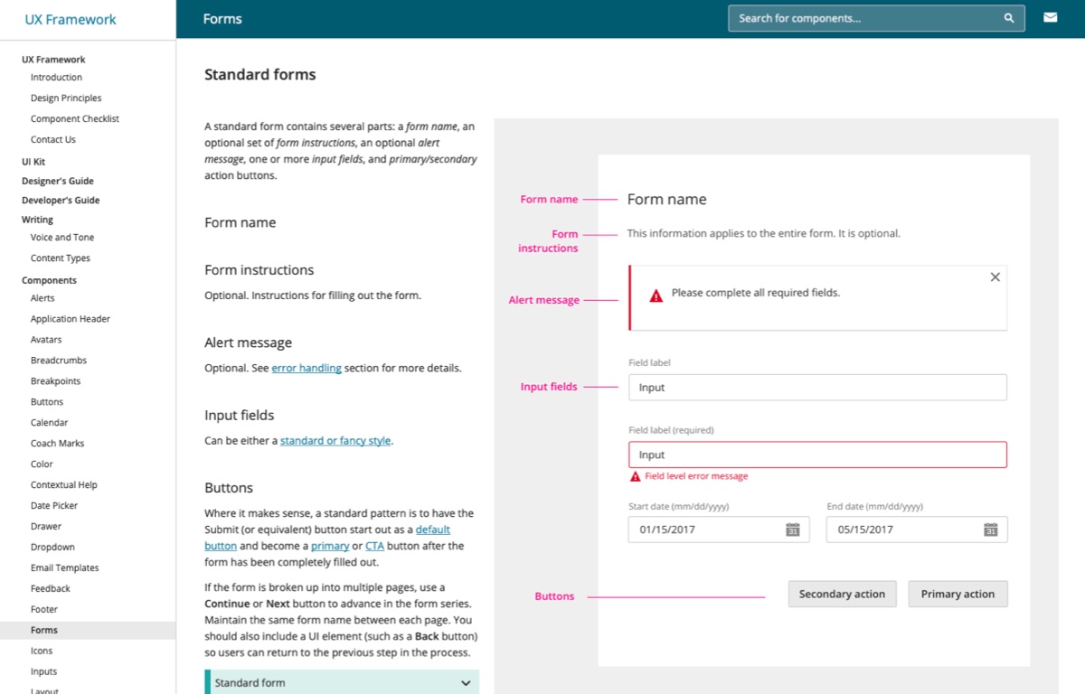
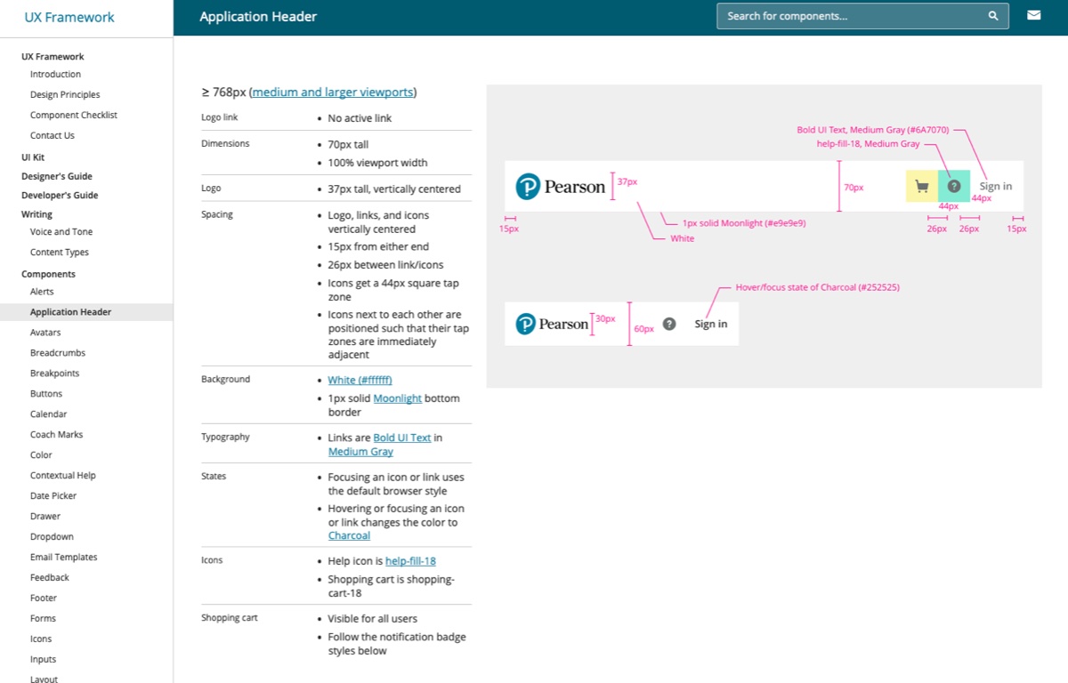
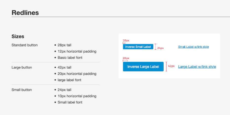
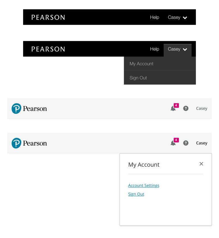
A particular candidate for improvement of the component pages was our treatment of redline specifications.
Originally we just linked to downloable images of the components annotated with all their dimensions and details.
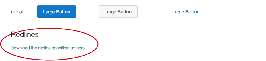
I extended our component template to support concise tables for pulling out these details as selectable and copyable text.
Pairing the tables with embedded images made the information easier to access and utilize.
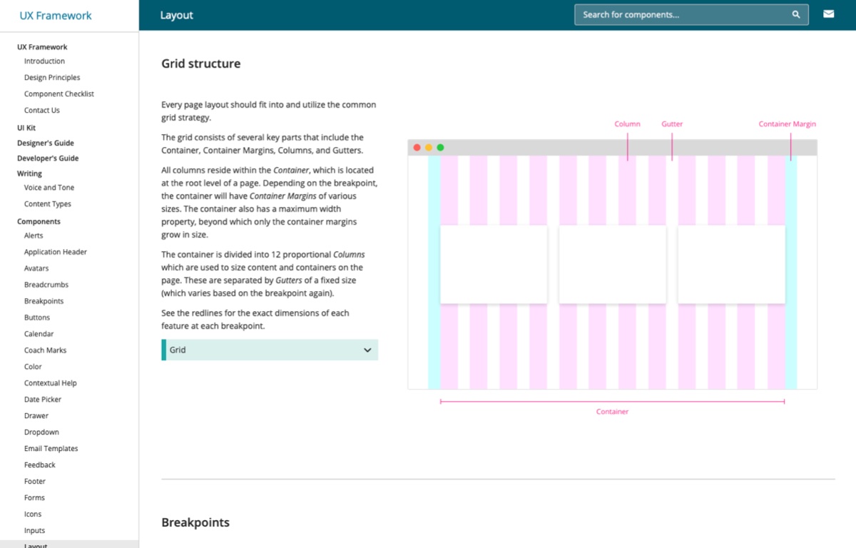
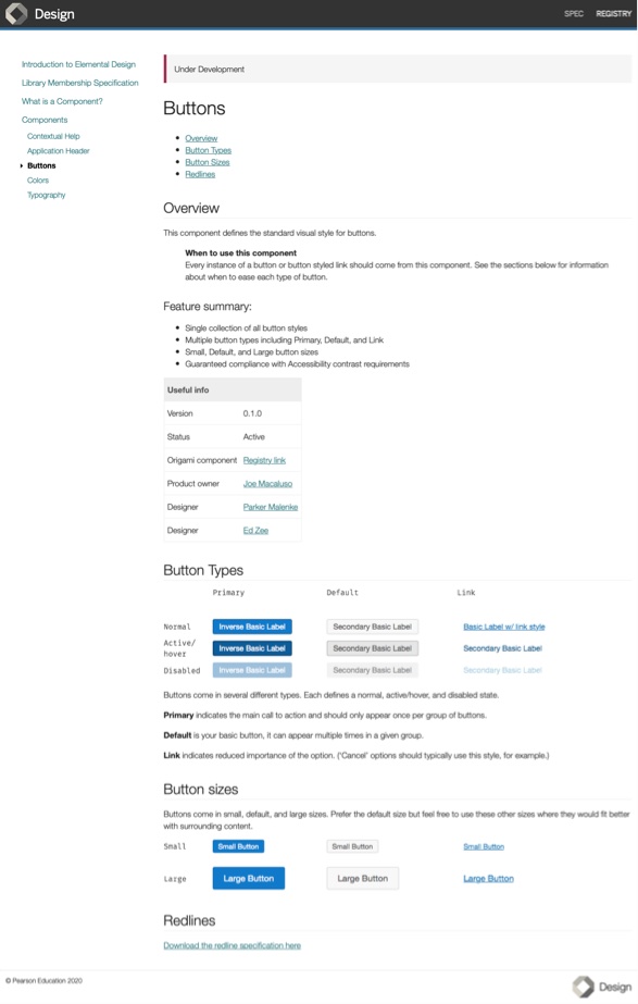
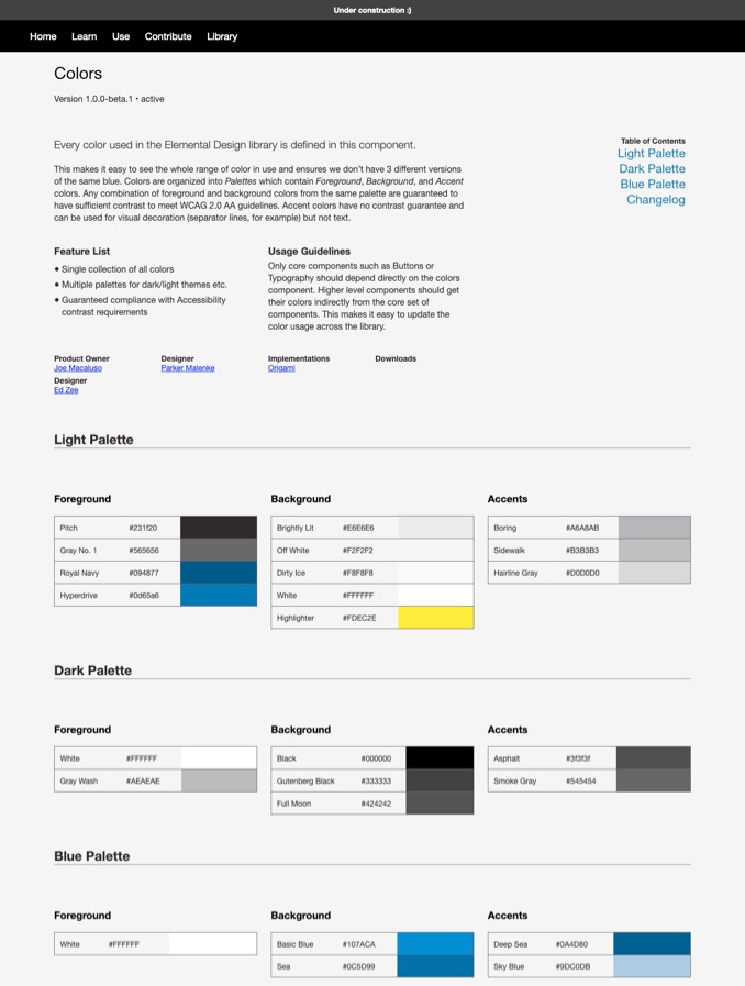
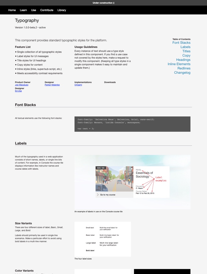
With these goals in mind I designed and built a dedicated template for our component pages.
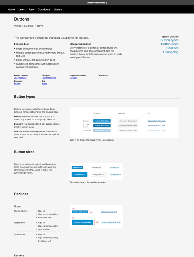
Instead of one long undifferentiated column of content, we could now pair visuals directly with their associated explanations, summarize key facts at the top of the page, and precisely annotate component specifications.
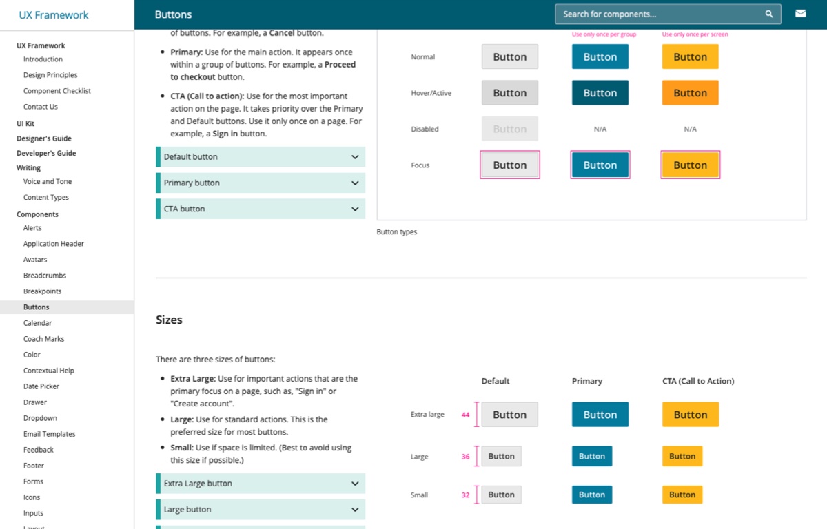
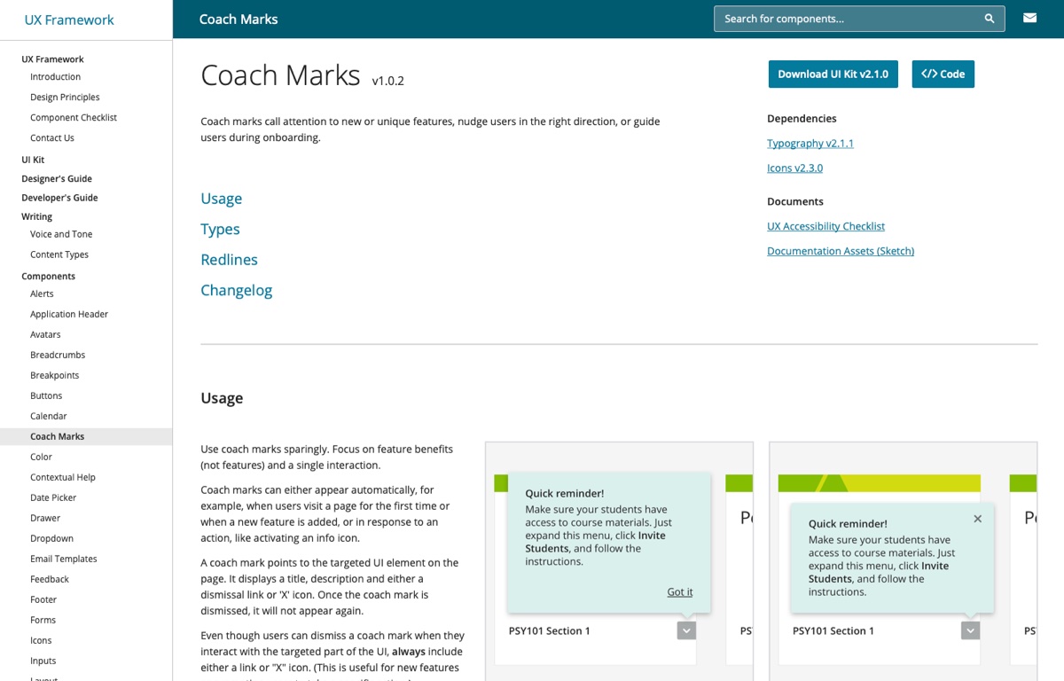
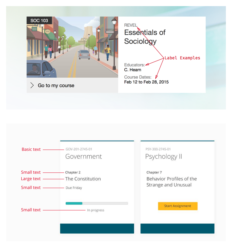
Our core component pages updated with the new template.
4. Ensure quality
Of course we wanted our guidance to be easy to read and understand, but we also wanted designers to trust the quality of our components.
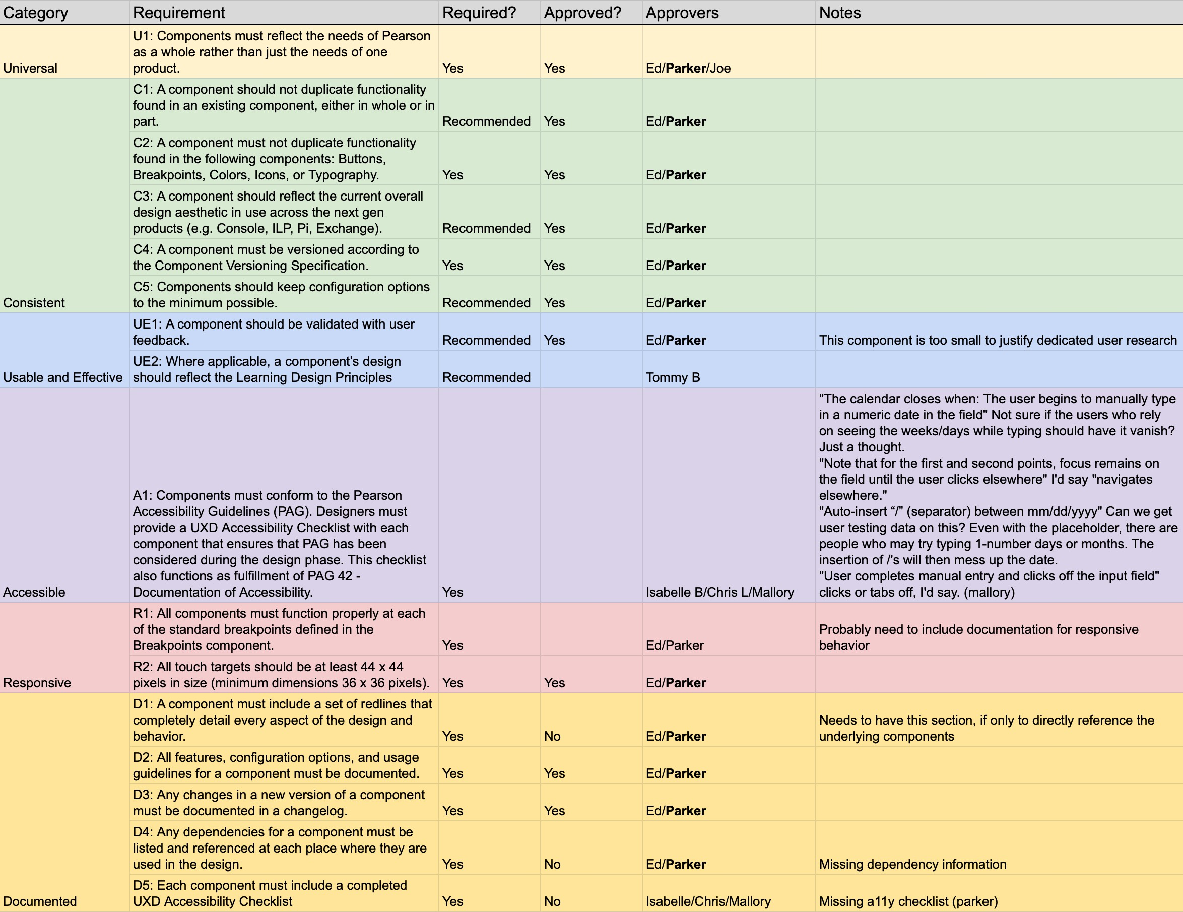
To achieve this we created the “Library Membership Specification” — a checklist of the various steps and reviews we would follow to ensure quality.
Deep dive
Baking in accessibility
Deep dive: Baking in accessibility
Creating accessible experiences was a key directive throughout Pearson projects. Not only did our products have legal requirements for accessibility, but we also felt that making our educational resources available to the broadest range of people possible was the right thing to do.
The design system had a unique opportunity to help achieve this goal, as any investments we made in enhancing the accessibility of shared components would be multiplied across all the teams that followed our guidance.
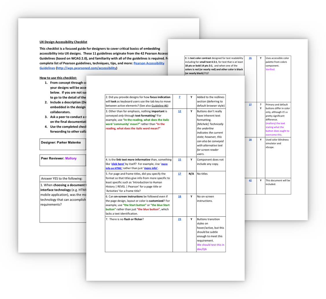
Pearson’s accessibility specialists created a UX Design Accessibility Checklist for verifying compliance of design elements. We committed to reviewing every component we created against this checklist.
We were also fortunate to work closely with a knowledgable accessibility developer, who helped us come to the best solution for more complicated UI elements.
An example checklist from our button component.
Not only did the checklist publicly commit us to a certain standard of quality, it also helped us loop in feedback from key stakeholders, such as visual design, accessibility, and development.
We asked these stakeholders for input when creating the checklist steps and then involved them in regular reviews of our new components.
Lesson Learned
While this process perhaps helped set expectations for quality in the early days of our design system, we eventually learned that it also discouraged contributions to our library. See how we addressed this challenge in the next case study, Evolving Pearson’s Design System.
Here’s an example of a completed checklist for our datepicker component.
5. Add more components
With processes in place to ensure quality we set out to expand our offering and create more components for product teams to use. It wasn’t just simple elements like typography and buttons that could be shared between teams.
More complex components would deliver an even higher return on investment: our team spent time upfront nailing the interaction, design, accessibility, and implementation; other product teams could then quickly adopt our work and trust they were adding high quality UI elements to their pages.
All told, we eventually created a robust library of over 30 different components covering everything from type styles to navigation patterns to date and time pickers.
We extended our design system with new and more complex components, such as icons, a global application header, and select dropdowns, among many others.


6. Training contributors
As we created more components our team gained a few additional designers to help out.
Most designers at Pearson don’t do much development, and our new members didn’t have the complete skillset for contributing directly to the website.
I created screencasts and documentation to train them on the key tools necessary to help out. This also set us up to easily onboard new designers and contributors in the future.
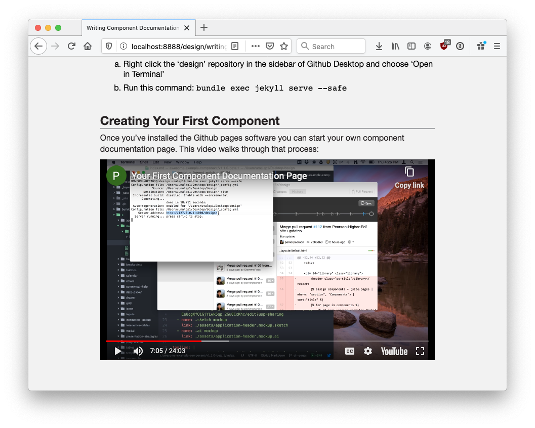
Here’s one of the screencasts I made to train new members of our team.
7. Rebrand components
At this point our design system hummed along with a solid team of contributing designers, processes to build in quality, and a robust website documenting all of our guidance.
The only constant is change, however, and it was around this time that Pearson underwent a rebrand, adopting a new logo, color scheme, and overall aesthetic.
Luckily the design system functioned as a simple blueprint for updating our elements with the latest direction. We went back through each component swapping out fonts, updating colors, and refining visual treatments.
Because we built a process for creating and updating our guidance we could complete the broad update relatively quickly.
Two examples of rebranded components: our application header and type styles.
8. Enhance documentation
Our components weren’t the only thing to get a new coat of paint. We wanted to continue improving our resources and took the larger organization’s rebrand as an opportunity to refresh our own website.
At this point our list was growing pretty long. We simplified the component navigation and added search functionality so designers could quickly find the guidance they needed.
We also redesigned the home page to better onboard people new to the system, and to highlight some of our newest features, like our sticker sheet made for Sketch.app.
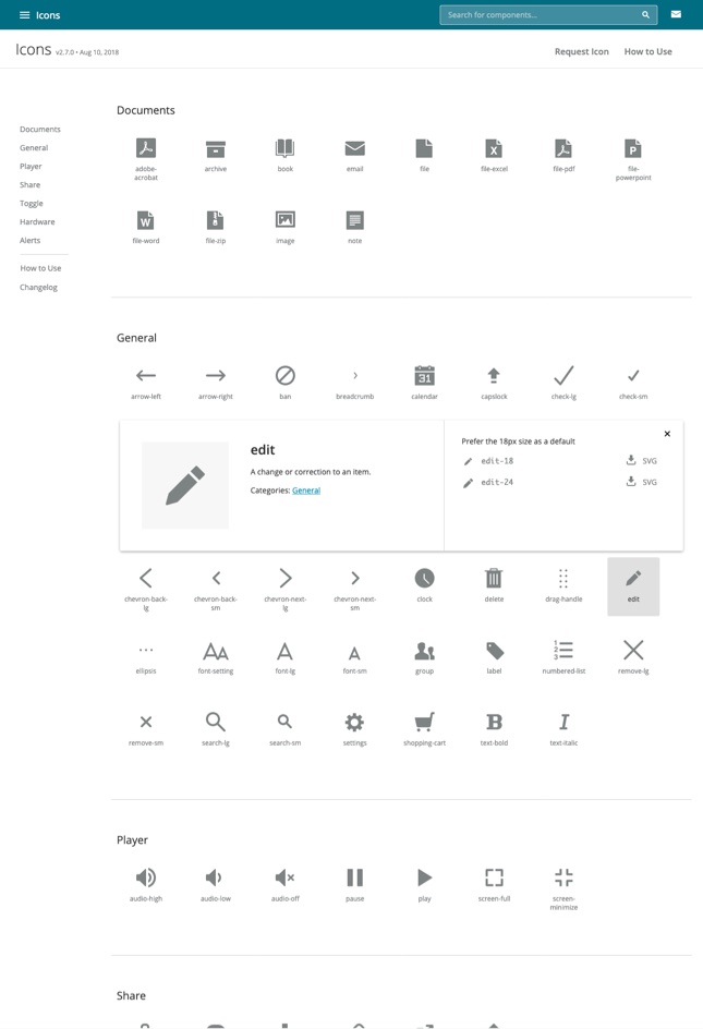
Some of the more unique component pages received updated designs better tailored to their unique information. For example, I improved the icons page with a more scannable and informative gallery overview.
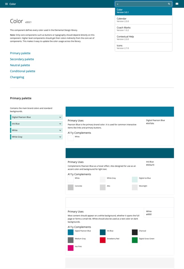
Our core component pages updated with the new template.
Outcome
We set out to save time and eliminate inconsistency with the first design system for Pearson’s higher education products. Ultimately our efforts resulted in:
A system of 30+ standard UI components to share across products.
Detailed usage guidance and redline specifications for each component.
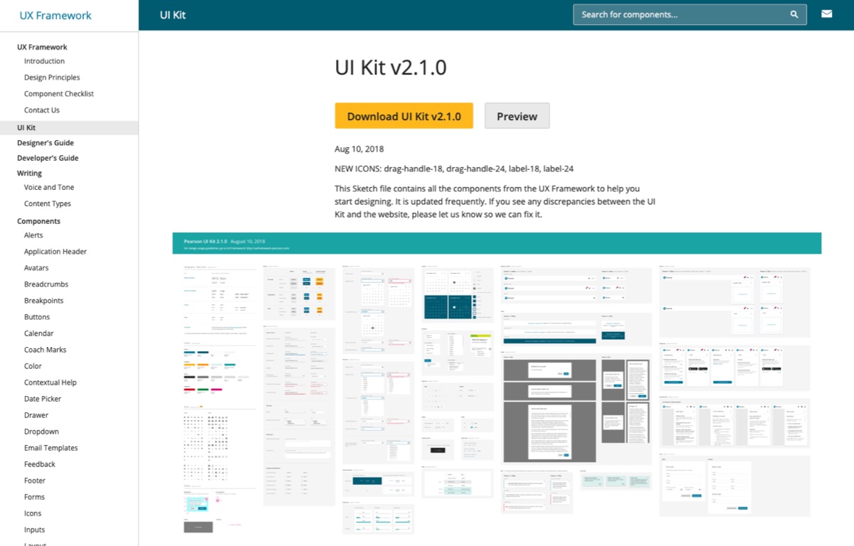
Sketch assets in a UI Kit that made implementing the design system fast and easy.
❌ Before
40+ different font styles
50+ unique colors
100+ different breakpoints
✅ After
12 workhorse font styles
16 flexible colors
5 simple breakpoints
After experiencing our resources, 86% of the design team agreed that Pearson needed a design system.
Half of surveyed designers said they used our guidance to help them make design decisions.
Here’s how Pearson designers described our work:
“It saves me a ton of time. It can help me focus on creating a better user experience.”
“A single source of truth.”
“One stop shop for most things and keeps designs across teams consistent.”
“Yay consistency! I think it’s well-organized too.”
“Well implemented, easy to use, and feels like flying compared to some of the pattern library setups I’ve encountered in the past.”
What I learned
A deeper understanding of the intricacies and dependencies of UI elements.
How to effectively teach technical topics to people new to the material.
An appreciation for how accessibility can be considered and incorporated in the foundations of a design system.
How to strike a balance between flexibility and simplicity.
Credits
Ed Zee
Team Lead
Joe Macaluso
Product Manager
Van Yang
Visual Design
Brook Stevenson
Interaction Design
Kim Adams
Dev Lead
Lynn Chang
Visual Design
Linda Tsai
Interaction Design
Mallory van Achterberg
Accessibility Developer
Next ➜
Read some of the lessons I’ve learned from working in design.