2018 – 2020
Evolving Pearson’s Design System
Leading the design system team to make improvements, streamline processes, and increase value
The Problem
Although we had successfully created Pearson’s first design system, we discovered a few areas for improvement as the system began to see greater use.
Components were created in a vaccuum and didn’t reflect the product context designers wanted to use them in.
Dev teams built multiple implementations of the same components because they didn’t share a common tech stack.
Changing or adding guidance was slow and bueaurcratic.
Adoption lagged behind our expectations and goals.
My Role
Inspired and lead a team of five designers and writers.
Shaped new strategic initiatives informed by user feedback.
Coordinated and planned team tasks based on leadership’s direction.
Partnered with key stakeholders to modernize our guidance.
Developed software tools to enable easy authoring of guidance.
Process
Our design system team changed leadership about two years into the project. A decision was made to do a comprehensive re-launch of the design system with a number of significant changes to address the issues we had identified in our first release.
The pillars of our reset included:
Refocusing on design resources by eliminating support for an official code library.
Partnering directly with key product designers to update our guidance with the latest and greatest UI elements.
Streamlining our processes to make contributions from other designers our primary source of new guidance.
To emphasize the significance of this evolution we even renamed the system (from the UX Framework to Gravity) and rebranded our guidance website.1. Focus efforts on design guidance
Our initial design system represented a partnership between our design team and a development team that built out a library of code for each component.
As we began evangelizing the system to more and more teams it became clear that it wasn’t feasible to expect them all to adopt a single front end tech stack. Each team had their own technologies, skills, and preferences, and we couldn’t cater to all of them.
“Our dev leads tell us they cannot use the code, and need to rebuild the component anyway.”
“In addition many dev teams build their own version of the framework component.”
Instead we decided to prioritize and focus our efforts on resources for designers.
We would still provide redlines and documentation for developers to implement our components, but we would no longer create an official library of code.
2. Partnering with product
As part of our new focus on the design side we partnered directly with key product designers to bring the components and patterns they used into our library of guidance.
For the first version of the design system we had just created our own interpretation of common UI elements based on audits and reviews of the various Pearson products.
Now we had the opportunity to partner directly with the key designers involved in Pearson’s latest and greatest design efforts. We analyzed the new designs to identify their constituent patterns and create new components specifically for them.
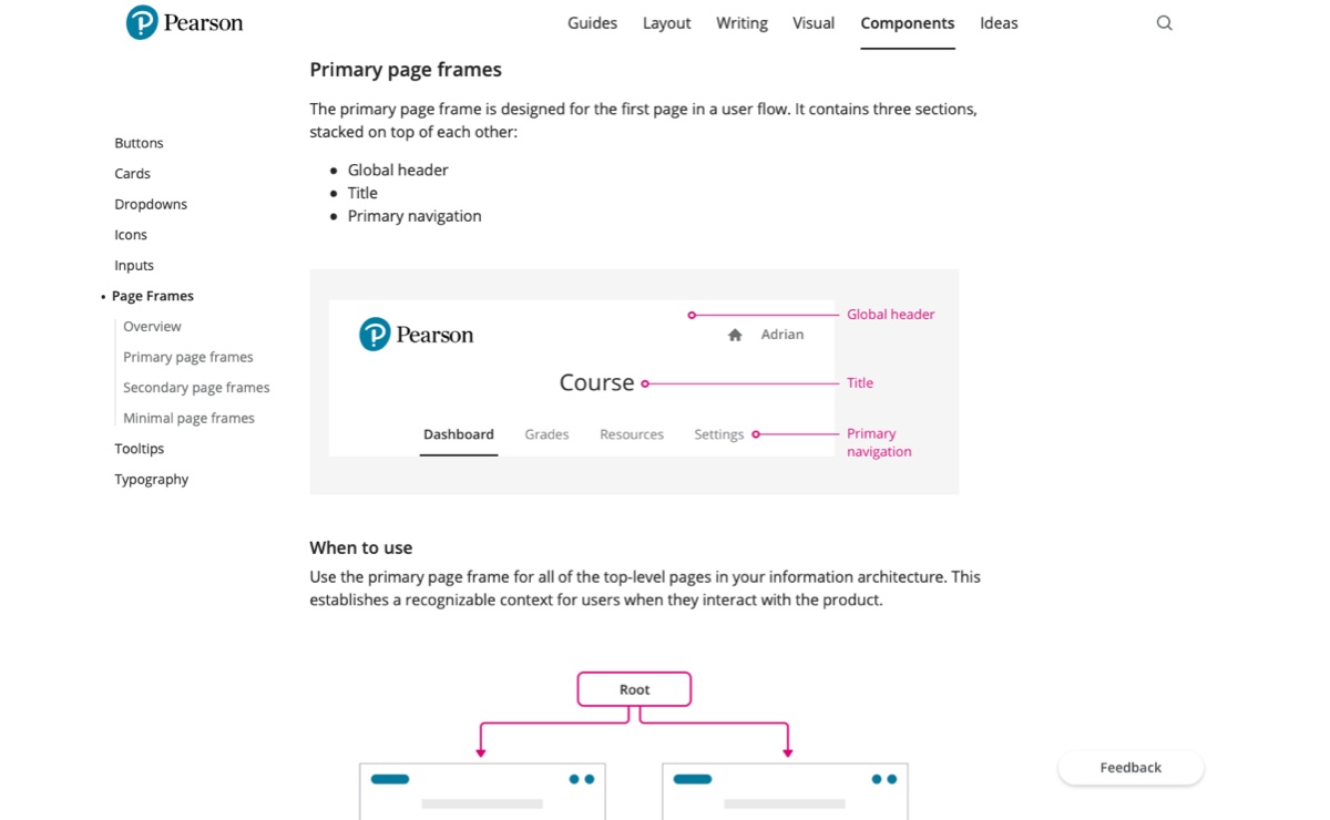
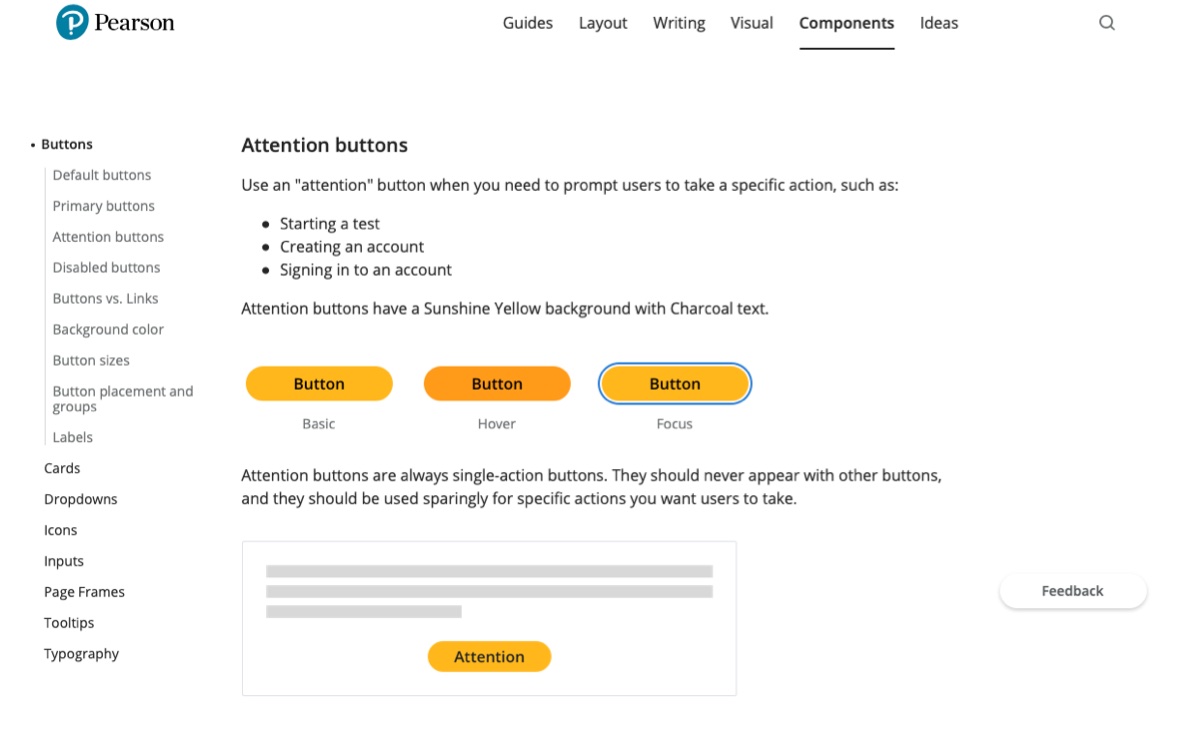
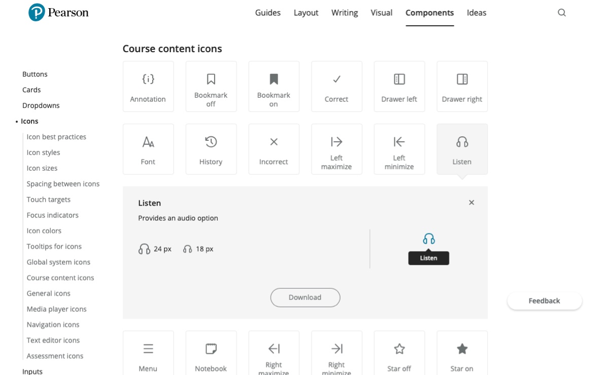
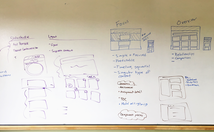
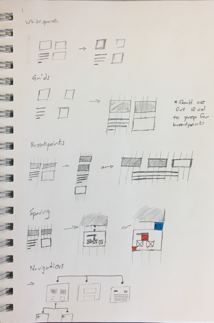
We used whiteboarding sessions with key product designers to identify the latest UI patterns and components.
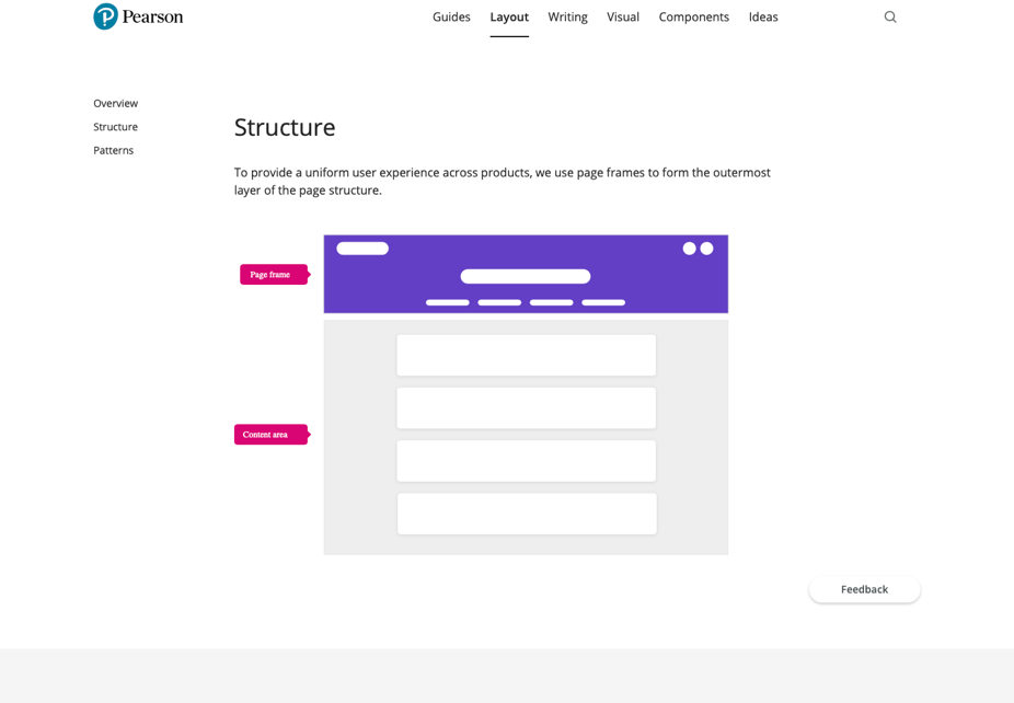
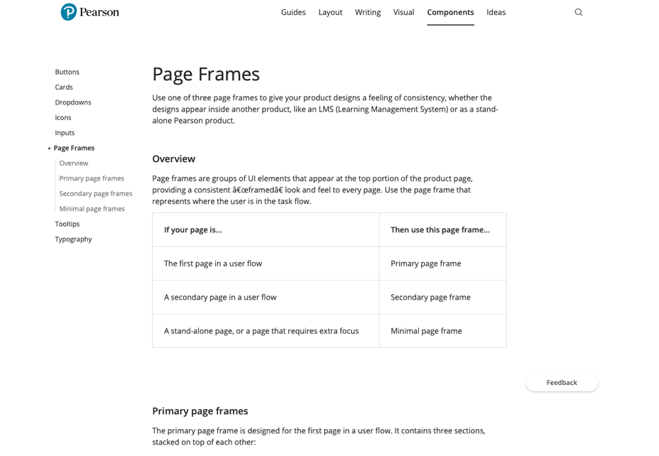
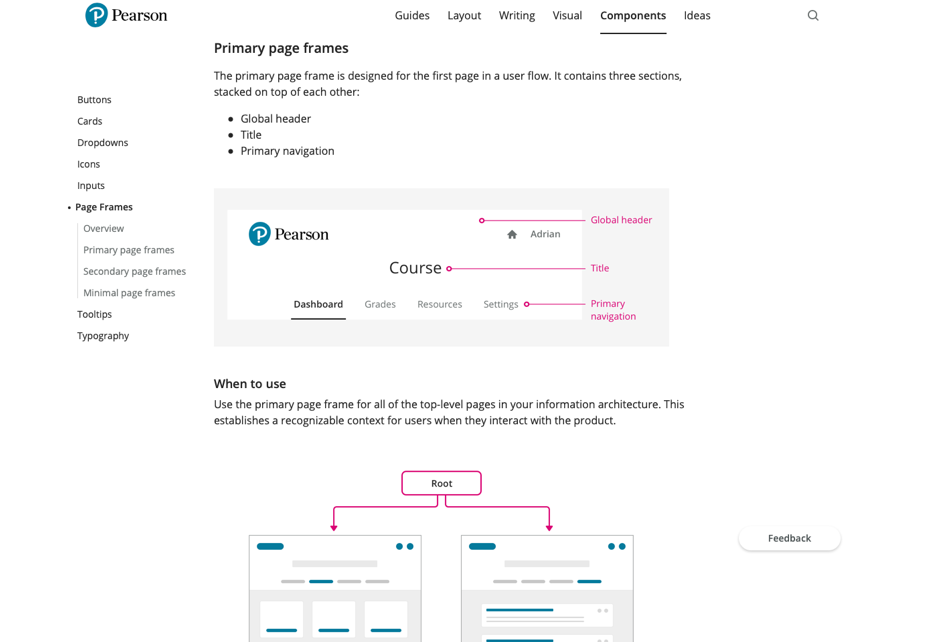
We could then extract these into new documentation. For example, here we’ve identified and created new layout and navigation patterns which we documented as the Page Frames component.
3. Offer higher level guidance
One bit of feedback we received about the original design system was that designers didn’t always understand how they should combine our components into complete pages and flows. We had documented the trees pretty thoroughly, but had little guidance around how to plant them into a forest.
We took our partnership with the key product designers as an opportunity to add higher level resources that explained the thinking behind the components and would help designers understand how each piece could fit together.
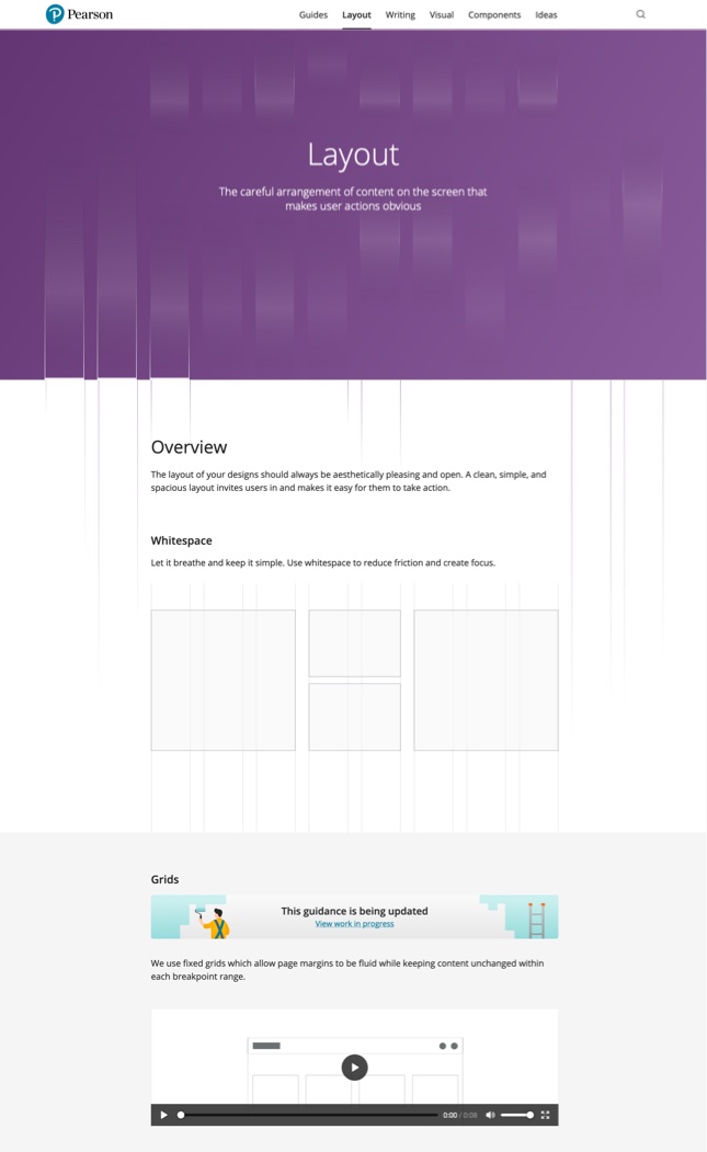
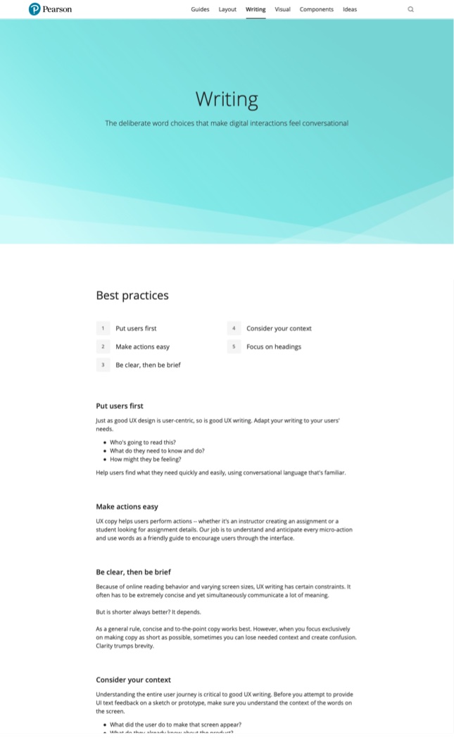
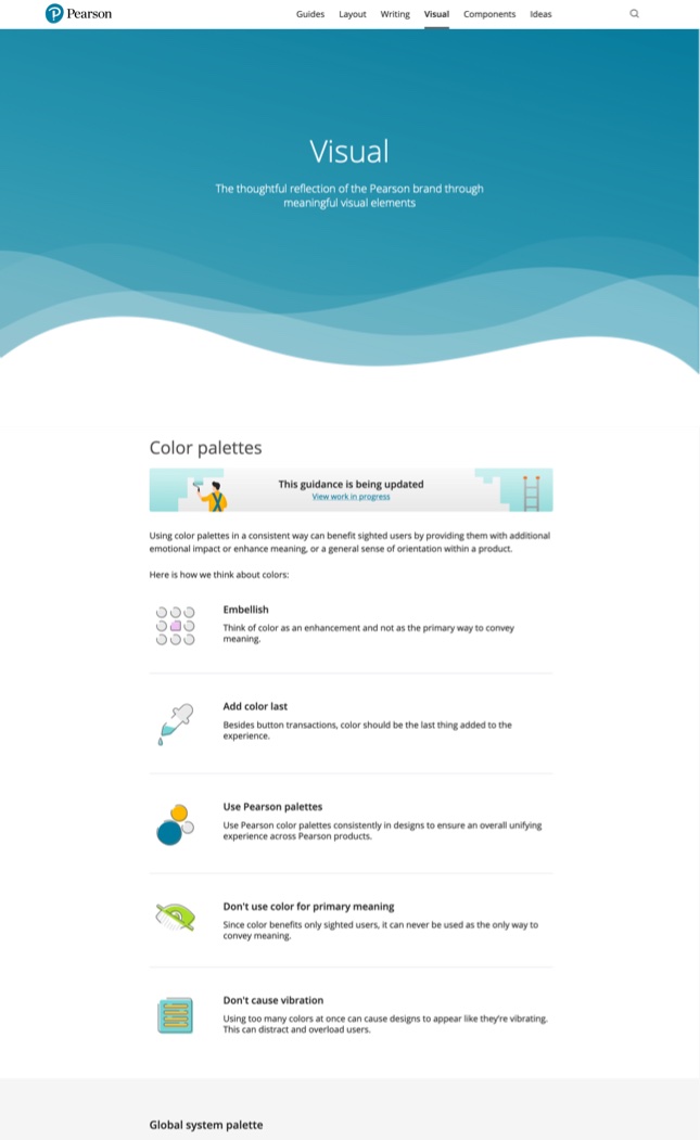
Together we created guides that covered the underlying decisions and approaches for topics such as our design principles, visual style, page layout, writing, accessibility, and globalization.
Over time we worked with other domain experts to add even more guides, including topics such as onboarding, data visualization, and animation.
These guides helped orient designers and created a shared context for understanding and using our various components.
Some of our earliest guides covered layout, writing, and visual style.
4. Invest in easier and more powerful authoring tools
Although we were seeding the updated design system ourselves, we wanted any designer to feel empowered to contribute to and evolve the system.
I had set up a Jekyll static website system to power the first version of our guidance.
Contributors needed some command line kung fu to install Jekyll and start working with git, but these weren’t common skills amongst the design team. In addition, our templates had grown pretty complex at this point and required a bit of domain knowledge to fully leverage.
Here’s what it was like working with our original Jekyll website.
Not super easy to contribute to without some technical skills.


If we wanted other designers to quickly and easily contribute we would need to invest in a better authoring tool.
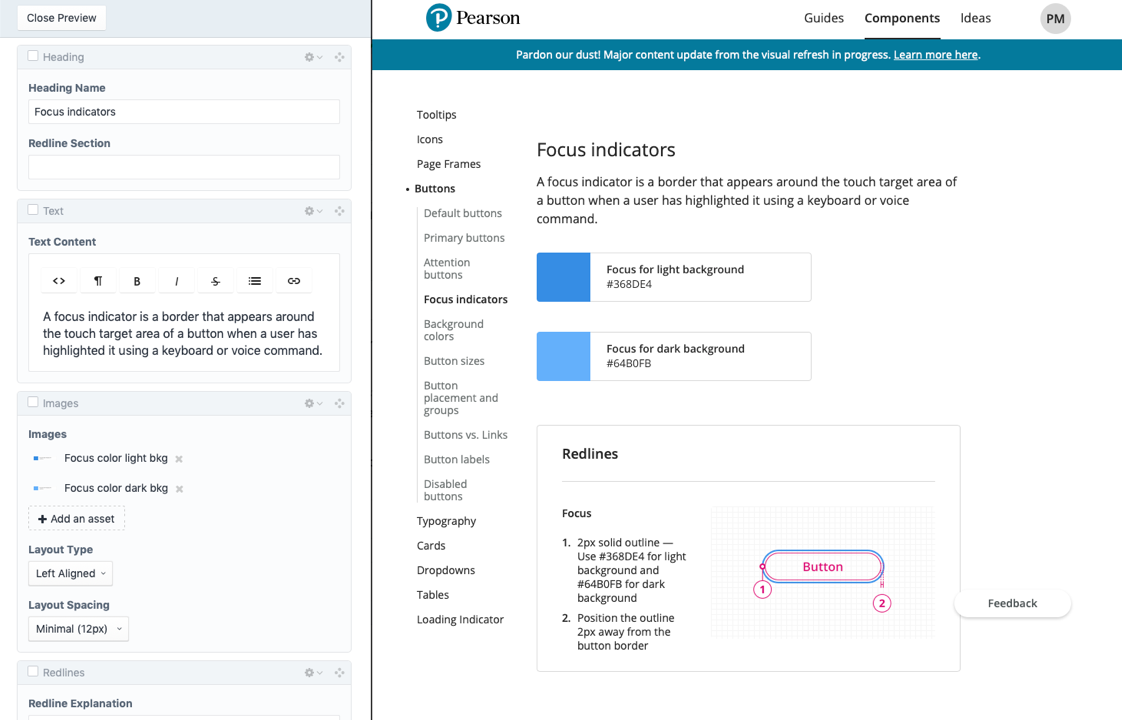
I drove improvements in this area, researching different options and ultimately choosing a Craft CMS installation. I set up and configured a server, customized our templates, wrote migration scripts to import our old content, and trained the rest of our team to begin using this new authoring tool.
Our custom Craft CMS made it much easier for anyone to quickly contribute edits or even whole new components.


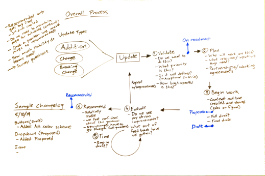
5. Simplify contribution process
In the first incarnation of our design system we had a 16 point checklist that each component had to meet before we included it in the library.
Although designed to ensure the quality of our guidance we found that this significantly slowed the creation of new elements and discouraged contributors from other design teams.
We wanted to make it easier to add new ideas to the design system while retaining our quality standards for finished guidance.
We explored processes that would allow contributions to start as rough ideas and then gradually mature into polished guidance. Instead of requiring contributions to go through a full checklist review before sharing with the team we created options for posting basic ideas earlier on in the process.
This allowed the whole team to share feedback and help shape the new guidance from an early stage.
We explored many different ways to streamline our process while retaining our quality and reliability.
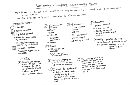
6. SWARM meetings
Another issue that prevented contributions to the design system was simply time, or the lack of it. Product teams tended to have very full schedules, tight deadlines, and often bounced between different projects. This made it difficult for them to find dedicated time to share the patterns and approaches they used.
We could make our tools simple and easy to use, but we couldn’t invent more hours in the day.
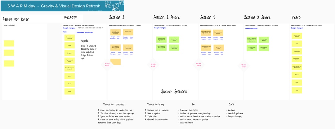
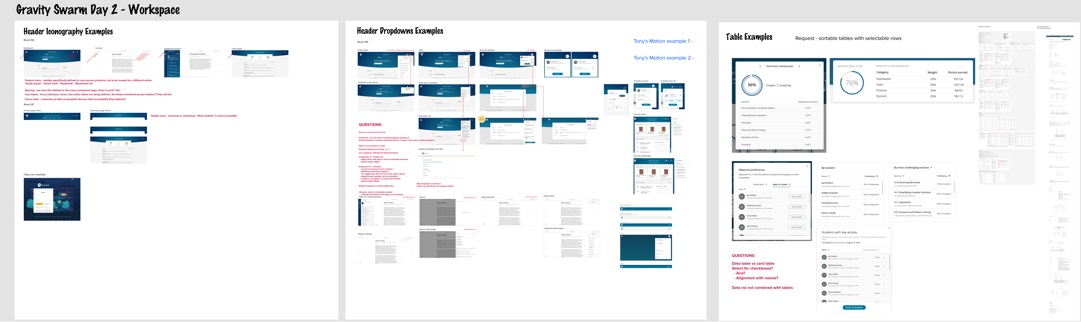
Instead we tried to meet the designers where they were at, and shift some of the contribution work onto our team itself. We created a series of S.W.A.R.M. (Surprisingly Wonderful and Refreshing Meeting) events where we could catch some precious time directly with designers to collect information about their latest patterns and approaches.
This was a workshop approach designed to make the most of just a few dedicated hours with various product designers. We would pre-plan an agenda based on our reviews of various product screens so that we could jump straight in to gathering information about new components and patterns.
We then spent several cycles internally cleaning up and finalizing the seeds planted in these meetings. Ultimately this proved to be an effective method for growing the design system, and we created several components based on input gathered in this way.
Here’s an agenda from one of our SWARM events followed by the output from one of the sessions.
7. Adopting Shape Up
As our design system team grew over the years we realized we needed to create some internal project management processes to help us decide what to work on, manage our time, and ensure we completed projects.
We were fortunate to work with a couple skilled contract project managers at various points, but unfortunately lost the budget for this role. I stepped up to take over these responsibilities.
It was around this time that Basecamp published their Shape Up book describing their process for creating and shipping product work. I thought several of the principles would help our team make more feasible plans and get better at completing projects.
I advocated for this to the rest of the team, helped teach them the new ideas, and got the green light to try out incorporating it into our workflow.
We focused on adopting the idea of shaping work to fit in a predetermined timebox before we committed to doing that work. The shaping process involves taking a raw idea, investing time to understand the underlying problem, choosing a general solution, and creating a boundary around the work so that it can fit within a predetermined timebox. It leaves room for the specifics of the solution to be guided by this boundary, but details are ultimately finalized during the execution of the work.
Before adopting this workflow we had a whole group of stories in our backlog tagged as “Needs more planning”, but we never seemed to put in the time to plan them. Mostly they just sat in the backlog. On the few occasions we did pull them in to active work they would invariably end up taking much longer than we had initially estimated.
Following some of the Shape Up practices helped us devote time to shaping these unwieldy stories into specific problems and a bounded solution. Switching away from estimates to timeboxes helped us finish work more regularly and ship new content and features, instead of carrying work over from sprint to sprint.
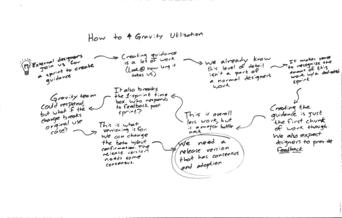
Here’s an example of some shaping I did around the idea of adding comments to our website.
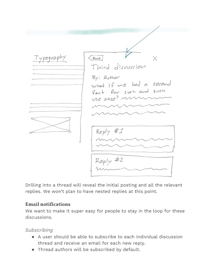
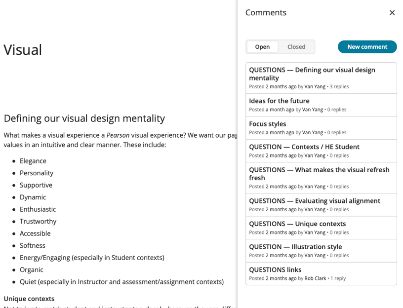
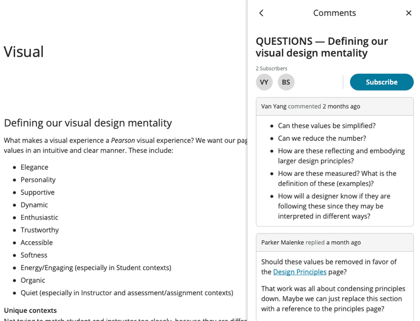
8. Comment System
One specific project that benefited from the shaping process was our addition of commenting tools to the website.
We’d had the idea for a while, but going through the steps of shaping the idea into specific chunks of work helped us refine the problem we were trying to solve and tailor the solution to the amount of time we wanted to spend on it.
The ultimate problem we were trying to solve was the high-touch nature of our contribution and feedback process. We used the swarm meetings as a way to kick off new contributions, but when our team worked to mature the rough outlines created in the swarm meetings we often needed some follow up input from the original designers.
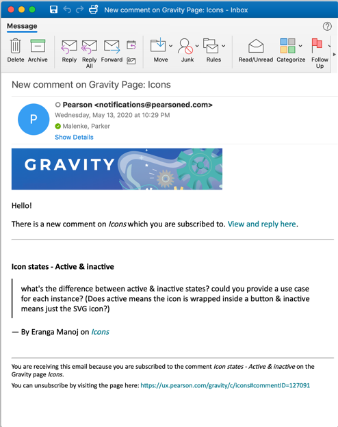
Frequently this meant scheduling meetings or trying to replicate the context for our ask with long emails. Instead we wanted to have a method to notify designers directly on the page where we had questions.
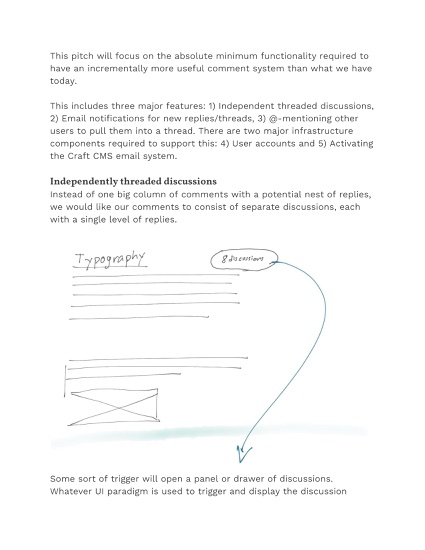
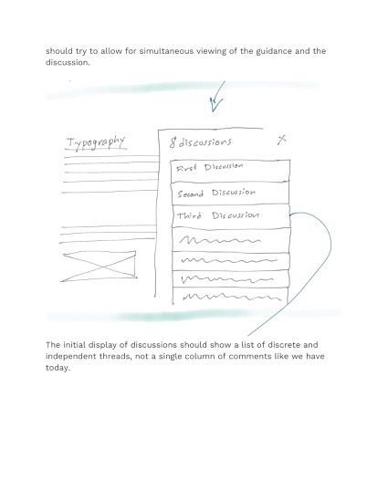
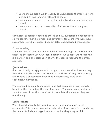
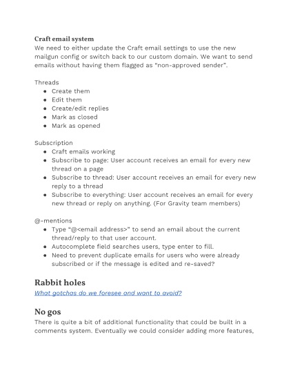
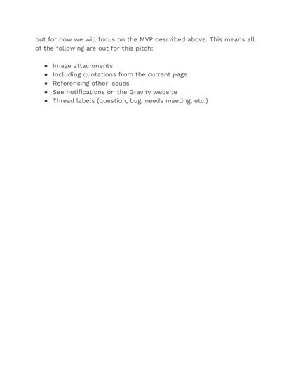
We started with the basic idea of adding a standard comments section to each page. After going through the shaping process we realized that we also wanted the ability to create separate threads for organizing different discussions, the ability to close out threads once we came to a conclusion, and a notification system so that we could ping people to keep them engaged in the conversation.
I built out the comment system in our Craft CMS instance, which involved creating a few custom backend endpoints, integrating with an internal Pearson email service, and building out the frontend interactions.
The completed comment feature live on our website along with an example of what the email notifications look like.
Outcome
I helped find, validate, prioritize, and create many improvements to our initial design system. Key achievements included:
Modernizing our design guidance based on real world use cases.
Expanding our resources with 10+ new high-level design guides.
Eliminating red tape checklists and processes.
Creating simpler authoring tools to encourage contribution.
Streamlining discussion with new commenting features.
We saw a roughly 50% increase in traffic from designers across our organization and their product and development partners.

What I learned
How to prioritize work and shape it into meaningful chunks for our team to complete.
The intricacies of maintaining a design system and keeping it relevant over time.
The importance of staying flexible and adjusting processes to match real-world needs.
How to configure and customize Craft CMS, including some basic DevOps concepts and the Ansible server management tool.
Credits
Rob Clark
Team Lead
Van Yang
Visual Design
Hawthorn Mineart
Interaction Design
Beulah Pidakala
Project Management
Meredith Williamson
Visual Design
Brook Stephenson
Interaction Design
Laura Wixted
UX Writing
Wei Feng
Frontend Development
Next ➜
Read about the origin story of our design system in Creating Pearson’s Design System.